


The 2021-22 NBA City Edition jerseys are finally here! This is one of my favorite times of the NBA season, as fans have a new jersey and typically a new court design to look forward to.
City Edition uniforms are meant to pay tribute to either the franchise’s history or the city in which they play. With this year being the NBA’s 75th anniversary, all of these jerseys are more heavily inspired by the team’s past compared to recent years.
When I first saw the jerseys that were released, I wasn’t too impressed. After further consideration, I have come to the conclusion that this is the best line up of City Edition uniforms we have ever seen. Nike has released an article explaining all of the little details that can be found in each jersey, and I highly recommend checking it out.
At the end of the day, this list is my opinion. You may feel that I’m wrong, and that’s okay, because I probably am. Take what you want from this list, but this is my ranking of the 2021-22 NBA City Edition jerseys.
not included: Phoenix suns, utah jazz
I decided to leave any jerseys that have been previously worn off this list. Both the Phoenix Suns and Utah Jazz decided to bring back their City Edition jerseys from last year, and rightfully so. It would have been a shame to see the Suns get rid of arguably one of their most iconic looks after one season. The Jazz probably should have moved on from this jersey set this season, but it does look good on the court, so I can’t complain too much.


RANKING THE 2021-22 NBA CITY EDITION JERSEYS
28: Denver Nuggets
There doesn’t appear to be any real direction with this jersey set. It seems like the designer decided to slap on a bunch of different elements from the Nuggets past without any real direction. This lack of direction just leads to a cluttered mess that will certainly be forgotten before the season is even over.

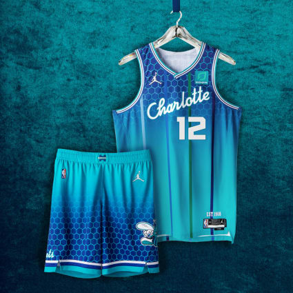
27: Charlotte Hornets
Similar to the Nuggets jersey, there seems to be a lack of vision with where the Hornets wanted to go with this. This uniform has implemented elements from the 1980s to elements all the way to today’s uniforms, such as the number font.
For the life of me, I cannot understand why they decided to go from a honeycomb pattern, into a blue gradient fade, and then back to the honeycomb pattern. Just to make matters worse, they decided to slap pinstripes on top of it all.
I love certain elements of this look as the Hornets have a good list of iconic jerseys they can work with. The Hornets wanted to pay homage to all of their previous looks in one jersey set, and the result is sloppy to say the least.
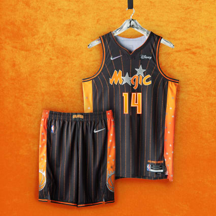
26: Orlando Magic
This feels like an AAU jersey more than anything. The Magic have made the decision to use the color orange to represent the orange groves that helped build the city’s economy. I will always be a fan of a team paying homage to its hometown, but the best feature the Magic could come up with is oranges?
Colors aside, the gradient side paneling and multi-colored stars make this uniform set feel dated, especially when compared to other looks on this list.
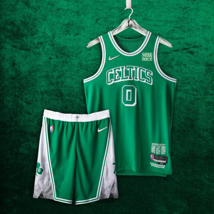
25: Boston Celtics
The Celtics are in an extremely difficult situation when it comes to releasing new uniforms. The franchise has been littered with NBA championships and Hall of Fame players, which has cemented the team’s legacy in the books. This level of history and culture have locked the Celtics into their iconic jersey set, making it difficult for them to branch out to do anything new.
What do we expect from the Celtics? Their hands are really tied with what they can do as the fan base is very much stuck in the past. Overall, I like the look of these for what the Celtics are working with.
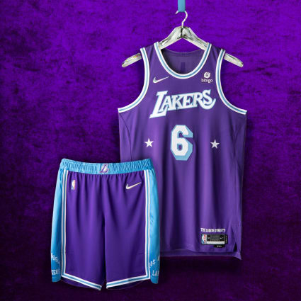
24: Los Angeles LAkers
It feels like the Lakers missed the opportunity to knock these out of the park. I do not understand why the franchise decided to implement the color scheme from the 1960s-era Lakers into this specific jersey set when they already paid homage to that era in last years City Edition jersey.
The Lakers aren’t remembered for their run in the early 60s, and the franchise has decades of unique uniforms they could have mashed together. I just would’ve liked the same amount of passion to be put into this uniform as many other teams put into theirs.
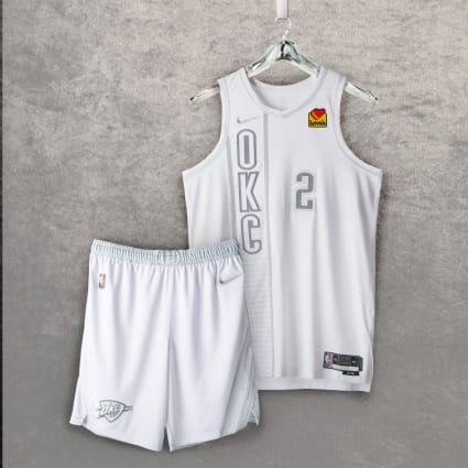
23: Oklahoma City Thunder
These are certainly hit or miss depending on who you ask. The Thunder don’t have a lot of history to work with, so it can be difficult to pay respect to the past. A very simple solution to this would be to take inspiration from the teams original home of Seattle, but with possible NBA expansion around the corner, I can understand why they didn’t go that route.
I personally am a fan of “ghosted out” looks like this one. I think it’s extremely sharp and hard to mess up. While I would have loved to see the Thunder take more of a risk, I’m content with the result that we got.
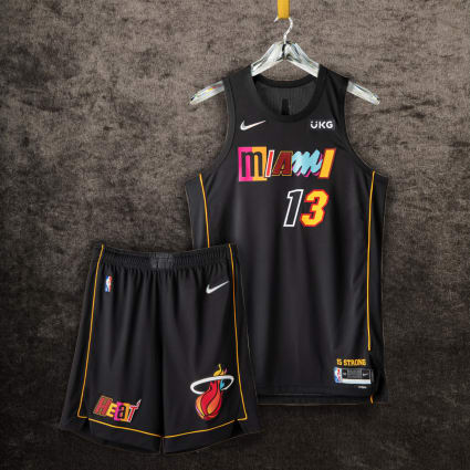
22: Miami Heat
Speaking of taking a risk, the Miami Heat have decided to combine every font style from the franchise’s history and throw in on a neutral canvas. I commend this effort as there was at least an attempt to make the jersey not look like an AAU kit.
Can’t say I hate it but I also can’t say I love it. Heat fans will probably buy this jersey for nostalgia sake alone. Other than dedicated Heat fans, I can’t see anyone outside of Florida hanging this up in their closet.
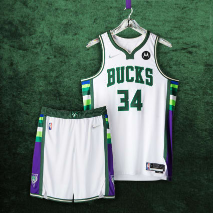
21: Milwaukee Bucks
This would have been the perfect time to fully commit to the classic “Deer Head” look to pay homage to the team’s history. The Bucks certainly have had one of the more interesting brand transformations in recent years, and that can be seen on the coloring on the side paneling.
The more I look at this jersey, the less I like it. It’s just consists of too many shades of green and inconsistent patterns. While I certainly think these will look better on the court, it’s a shame the Bucks didn’t do more with this.
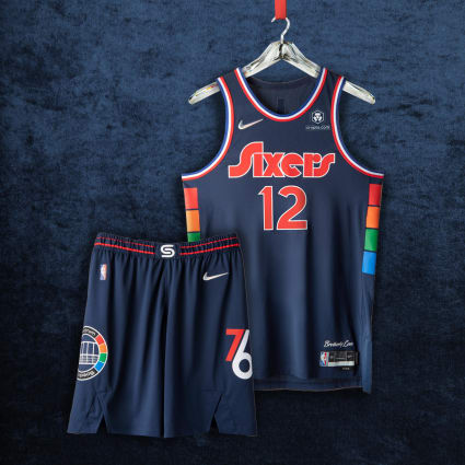
20: Philadelphia 76ers
The Sixers have spent 40 years at their home arena and decided to celebrate that legacy with these uniforms. The arena’s signature multicolor pattern runs up the sides of the jersey and the numbers and player names are inspired by the team’s graphic identity from the late ’70s.
This jersey is able to pay homage to the important marks of the franchises’ history in a respectful way. While this might not be a huge hit with the fans, the Sixers should be applauded for not making these atrociously ugly while still paying respect where it’s due.
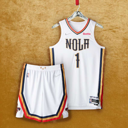
19: New Orleans Pelicans
Holy cow, this entire uniform set is phenomenal. The color scheme usage is bold but isn’t overbearing, which is harder to accomplish than you’d think. The “NOLA” text on the chest is simple yet impactful, making use of the New Orleans typography. The secondary logo on the bottom ends of the shorts is the perfect use of a secondary logo.
The real question is, why is this not the team’s primary uniform? It’s miles ahead of what the team is currently wearing and deserves to be worn year round. This jersey is perfect in every regard, but the designer really misunderstood the assignment of paying homage to the city.
I would place this in the top five of association jerseys in the league, but in terms of City Edition uniforms, it really isn’t doing anything special, which is the reason it is where it is on the list.
18: Dallas Mavericks
At first glance, these feel like the original Dallas Maverick jerseys with a Nike logo slapped on it, which isn’t a bad thing. I would have loved for these to have more of a modern twist as they didn’t really spice the uniform up at all. There are many different subtle elements to be found across this uniform that date back to the franchises early years. Bottom line, these certainly pay homage to the team’s past but don’t do anything to differentiate from the team’s former looks.

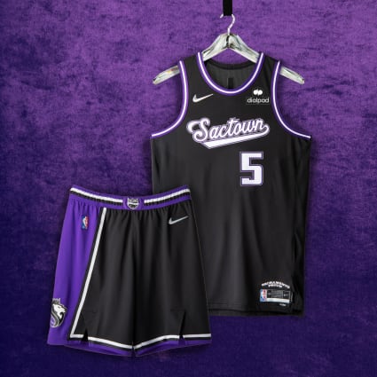
17: Sacramento Kings
From this point on, all the jerseys moving forward are really well done, which is impressive considering we still have 17 more to go.
There isn’t a whole lot to say about this uniform set. The shorts alone are arguably some of the greatest of all time as they are executed beautifully. This is an extremely clean yet safe look for the Kings. Similar to the Pelicans, these just miss the mark on the what exactly makes a City Edition jersey special, but that doesn’t take away from the overall look of the uniform.
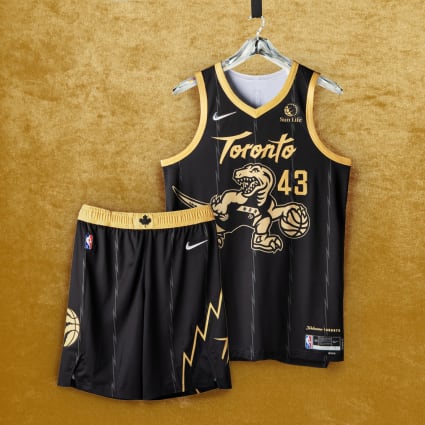
16: Toronto Raptors
The Raptors have teased us for the past three years about potentially bringing back the franchise’s iconic purple Raptor look. This year would have been the perfect time to bring that look back, but I am happy with what we got.
This uniform is extremely fun to look at as it brings in many elements from the team’s past while giving it a modern, bold look. The Raptors continue to add gold into their secondary color-scheme with it taking center stage this time around.
It is enjoyable to see the Raptor make his return with the team’s classic pinstripe pattern etched throughout the uniform. While these might not be what the fans wanted, they certainly will stand out among the crowd.
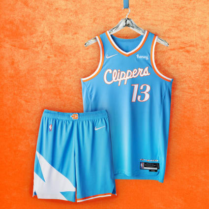
15: La Clippers
Similar to the Raptors, this is just a fun uniform set. It is extremely loud in appearance and is definitely a departure from the Clippers uniform sets from years past. The Pacific blue was inspired by the team’s past incarnations as the Buffalo Braves and San Diego Clippers.
The uniform is extremely clean in design while still paying homage to every aspect from the Clippers past. I’m sure the players and fans will enjoy seeing the Clippers wear something a little off the beaten path of what the team is used to.
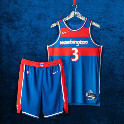
14: Washington Wizards
It was only a matter of time before the Wizards decided to bring these bad boys back. These are near carbon copies of the team’s uniform set from the 60s and 70s when they were the Bullets. There isn’t a whole lot the Wizards changed from those uniforms to this one besides the updated font across the chest. The Wizards hit a homerun with these by not trying anything new with an iconic look.
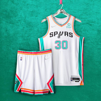
13: San Antonio Spurs
The Spurs certainly caught wind of the fans approval of the team’s City Edition jerseys from last year. This bold color scheme comes from the fiesta stripes that first appeared on the team’s warm-up jerseys in the mid-90s.
It’s nice to see the Spurs do something other than the team’s black and gray color scheme while still making the change make sense with the franchise’s history. My only complaint with these would be the inconsistent stripe sizes across the entire uniform. Most casual fans won’t notice this, but it certainly jumped out to me.
Overall, I love these. They’re very fun and a good change of pace for the Spurs.
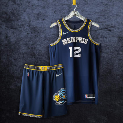
12: Memphis Grizzlies
This is a prime example of how all of the City Edition jerseys should have been handled this year. On first glance, you would think that these are the same Bulls script uniforms from the past. When you start to look deeper, you begin to realize all of the different factors at play here.
There isn’t a whole lot to say about this look from the Grizzlies. It looks good and there really isn’t an argument to be made against that. I think this jersey does a good job at hiding the franchises historic elements throughout the jersey.
This is a modern take on the Grizzlies rich history, dating all the way from British Columbia to Tennessee. I would say they took the safe route, but it definitely worked out in their favor.
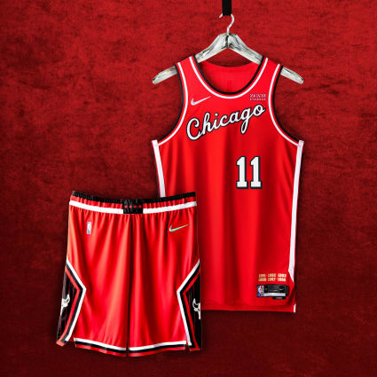
11: Chicago Bulls
The script “Chicago” is iconic at this point and doesn’t need any explanation. The side paneling dates back to the original Bulls team with the city’s flag living on the stud of the belt buckle. The diamond cutout on the shorts with the white Bulls logo and black pinstripes all date back to the Bulls of past.
These are all elements you wouldn’t notice right away but certainly are present. The Bulls were able to take individual elements from the team’s past and throw it together in this modern throwback.
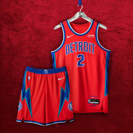
10: Detroit Pistons
There definitely will be some personal Detroit Pistons fan bias when talking about this jersey, so beware.
Detroit fans having been crying for years for the Pistons to bring back the team’s 90s teal color pattern and iconic flaming horse logo. While I may also be one of those crying fans, I do feel there is no point to rush those out until the team is good again. Creative director of the Pistons Big Sean said these designs typically take two years before they are finalized. The Pistons will definitely be bringing back the teal jerseys sooner rather than later, but for the time being, this is what we’re working with.
It’s nice to see the Pistons wearing an alternate jersey that doesn’t say “Motor City” across the front. This is an extremely clean and modern jersey while still being heavily inspired from past Piston generations.
The side paneling is a direct nod to the Pistons jerseys from the mid-to-late-90s. The shorts rock three different Pistons logos from over the years, most notably the classic flaming horse logo on the belt buckle, which looks phenomenal. Pistons fans certainly get their nod to the 90’s Pistons with teal making its appearance on these kits.
Furthermore, this uniform set is flashy and modern while still respecting the past. There definitely was some love put into this jersey, which is a good change of pace for the Pistons.
9: Indiana Pacers
The Pacers have had phenomenal City Edition jerseys over the years, and this year’s iteration certainly continues that trend.
The Pacers decided to use the team’s wordmark from the late-80s and have executed it perfectly. The entire uniform has a consistent theme that is really focused around the team’s wordmark. These jerseys feel old with a modern twist, which is everything you could ask for. It stands out in a crowd and gives Pacers fans something to be excited about.

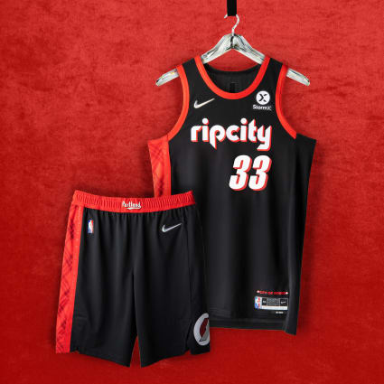
8: Portland Trailblazers
From this point moving forward, these jerseys are considered to be flawless in my book as they can certainly stand the test of time.
Having “Rip City” in the teams retro 90s-style font across the chest was the right move. I can’t stress enough how much I love the stripe and pattern going down the one side of the entire uniform. The belt buckle features “Portland” in the 70s-style font from the original Blazers teams. These are everything you would want from a City Edition uniform.
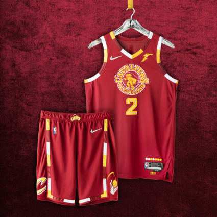
7: Cleveland Cavaliers
When these jerseys originally leaked over the summer, I wasn’t the biggest fan of them. Now seeing the official product, it is an elite City Edition jersey.
The uniform features every relevant logo the Cavaliers have ever used with the team’s original logo taking center stage. I am in love with the piping found on the collar and sleeves as it truly stands out among the crowd. The execution on this jersey is beautiful as everything feels like it is exactly where it should be.
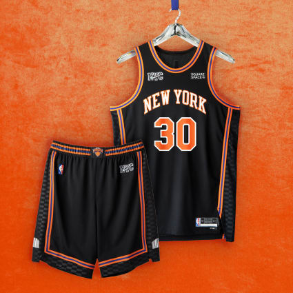
6: New York Knicks
I am at a loss of words on where to begin describing this jersey. I guess the franchise decided to kick the uniform game into full gear now that the team is relevant again.
The most notable feature of this uniform set is the pattern going up the side of the jersey and shorts that pay homage to the flooring in Madison Square Garden. The belt buckle hoists the teams classic logo and the shorts also contain the number of every retired Knicks player.
The black is gritty and aggressive, which accurately describes the current state of the Knicks. This look is truly amazing.
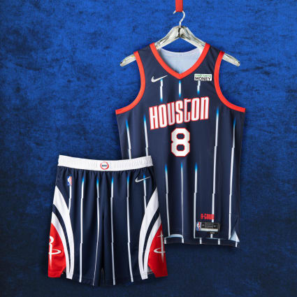
5: Houston Rockets
I cannot understand for the life of me why the Rockets didn’t feature the team’s 90s logo on the center of the jersey. While there certainly are multiple decades being featured in this look, it is very apparent the team’s 90s look was the main inspiration.
Primary logo aside, these look incredible and will look even better on the court.
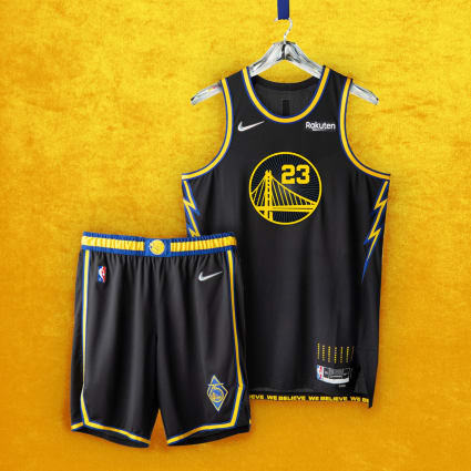
4: Golden State Warriors
I don’t think enough people are talking about how cool this uniform is. Golden States’ primary colors of blue and yellow explode off the jersey due to the black backdrop. The pattern inside the Golden State logo pays homage to the roof of the teams former arena. As a tribute to the “We Believe Warriors” of the late-2000s, lightning bolts line the uniform’s side panels
The more I look at this jersey, the more I fall in love with it. It feels very new and bold while still remaining relevant with the Warriors’ current image.
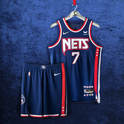
3: Brooklyn Nets
These final three can all be interchanged with one another, and I wouldn’t complain too much.
This look pays homage to the team’s path from New York to New Jersey and back again. The side paneling pays its respect to the repeat Eastern Conference championships from the 2001-02 and 2002-03 seasons. The jersey subtly features all of the team’s former logos in the bottom right by the Nike tag.
It doesn’t take a graphic designer to look at these and tell you they are awesome. I would pay a lot of money to have this jersey in my hands right now.
2: Minnesota Timberwolves
My jaw dropped when I first saw this jersey. The Wolves brand image is so boring and bland it was a pleasant surprise to see this many elements from the team’s past make an appearance.
The blue, green, and white color palette of the uniform returns from the team’s inaugural 1989 season. The wordmark and forest images are inspired by the early-2000s era, and the guard hair patterns on the shorts capture the essence of the wolf.
This City Edition jersey is one of the best NBA jerseys in recent memory. It takes the classic Timberwolves look and brings it to the modern day flawlessly.

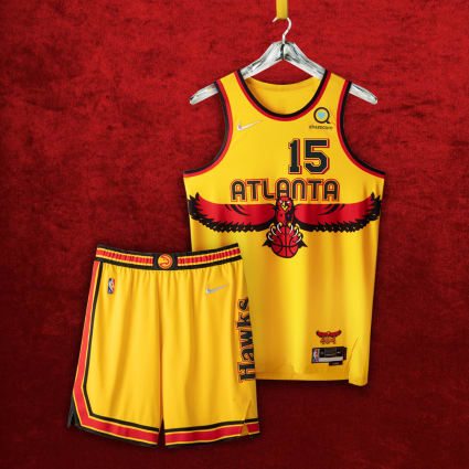
1: Atlanta Hawks
To even begin to describe the elegance of this jersey would be a disservice to the designer.
The numbers on the front as well as the stripe on the side of shorts are inspired by the team’s first uniforms dating all the way back to the late-60s. The beloved wingspan logo from the 90s is front and center, stretching across the entire length of the chest.
The Hawks have done an excellent job at rebranding the team over the past couple of years, but this certainly triumphs everything else they have done.
Looking for more jersey rankings?
If you’re looking for more gear rankings, check out my other article breaking down all 30 of the 2021-22 NBA Icon jersey.

