


The 2021-22 season marks the NBA’s 75th anniversary, and we’ve seen countless jerseys in the league’s seven-and-a-half decades. There was a big change in 2017 when the NBA innovated to use Icon and Association uniform sets rather than the traditional home and away pair, and with a new season, we have a new collection to consider.
Before the campaign officially tips off, let’s dig into all 30 if the Icon jerseys the 2021-22 NBA season has to offer, ranked from worst to best.
ALL 30 NBA ICON JERSEYS RANKED
30: MINNESOTA TIMBERWOLVES
If you opened a Nike jersey catalog, this uniform would be one of the stock options. There is nothing special about this kit, and it’s a real shame considering the Timberwolves old color scheme.

29: MEMPHIS gRIZZLIES
This kit would be on the next page of the Nike jersey catalog. The entire Memphis rebrand is questionable to say the least, and this jersey leaves much to be desired, putting it near the bottom of the NBA.

28: wASHINGTON wIZARDS
This color scheme is awesome, and so is the team name. But for the life of me, I can’t really put my finger on why this jersey doesn’t work. It just feels like there is too much going on all at once.

27: nEW oRLEANS pELICANS
The overall design of this jersey isn’t bad – the font is very unique to New Orleans. The real crime is the team’s color scheme. It very easily blends into the crowd. You will never see a frat kid wearing this jersey at a party.

26: dALLAS mAVERICKS
Is this really the best we could do? Dallas has one of the coolest names and logos in the the NBA, and this was the best it could do? Most of the team’s alternate/throwback kits have been well received, yet this continues to be the team’s primary uniform.

25: MIAMI hEAT
In 2011, this would be a top jersey in the NBA, but this ranking is happening in 2021. It’s a shame that the team has retired it’s Miami Vice color scheme. These feel like a downgrade compared to the vibrant pink and blue the team wore over the past couple of years.

24: iNDIANA paCERS
This doesn’t feel like a Pacers jersey, especially when you look at the team’s jersey history. This is the worst jersey the Pacers have worn in a long time, and they need to make their City uniform their primary kit.

23: pHOENIX sUNS
This is a tough one, because there is nothing blatantly wrong with this jersey. It just feels very outdated, but that doesn’t make it bad.

22: hOUSTON rOCKETS
This feels like a downgrade compared to what the team was wearing before. There is nothing fun about this jersey, and the overwhelming amount of black is questionable.

21: dETROIT pISTONS
As a Detroit Pistons fan, I have no idea why we are still wearing these. The entire city of Detroit wants the old horse logo back. There is no reason to keep wearing these jerseys from the early 2000s.

20: bROOKLYN nETS
At this point of the list, none of these jerseys are bad, but they definitely leave room for improvement. I’m not really sure what more the Nets could add to this given the team’s color scheme and logo.

19: cLEVELAND cAVALIERS
Something about this shade of maroon rubs me the right way, especially with the hints of yellow in there. My biggest complaint is the font the Cavs are using for the numbers, but this is a very original look and I respect it.

18: bOSTON cELTICS
It would be a crime if the Celtics changed anything about this kit given the franchise’s history. There isn’t anything inherently wrong with this jersey, but compared to the other kits on this list these, fall to the No. 18 spot.

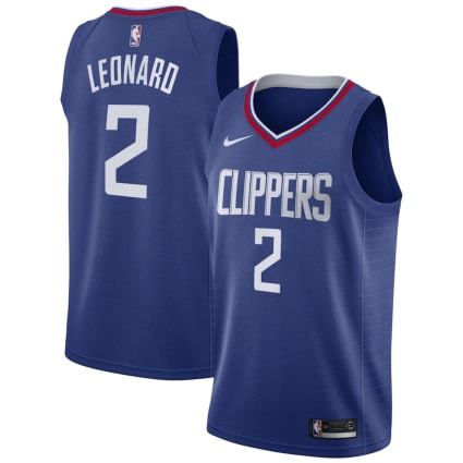
17: la cLIPPERS
I really enjoy this jersey overall. It’s definitely on the safer side of things, which is never a bad thing if you can make it work. I’m in love with the collar on this jersey and how it’s the only spot of red on the entire kit. While I can’t think of any recommendations on what to change off the top of my head, I do believe a paid artist could make a cooler rendition of this jersey.
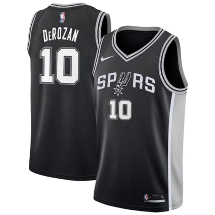
16: sAN aNTONIO sPURS
The Spurs could never change their jerseys, and I would be happy. This is a timeless look, and everything about it just works together so seamlessly. Considering the teams color scheme, this is a very well executed look.
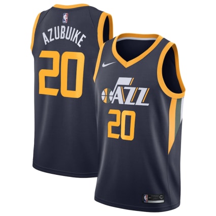
15: uTAH jAZZ
For having one of the weirdest color schemes in professional sports, the Utah Jazz have really found a way to stand out among the crowd. This is the perfect balance of yellow and navy with a splash of green.
14: tORONTO rAPTORS
The Toronto Raptors definitely get originality points for this one. It’s a jersey that will stand out among a crowd but isn’t trying to do too much. The upward arrow taking center stage is definitely a bold strategy, but I’d say it works out in Toronto’s favor.

13: oRLANDO mAGIC
I’m a sucker for pin stripes on a jersey, and the Magic pull it off so well. The jersey itself isn’t bold, but it doesn’t have to be when the colors are so perfectly balanced with one another.

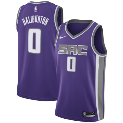
12: sACRAMENTO kINGS
It’s a shame that the Kings are a sad excuse for a basketball organization, because I’m in love with this jersey set. For whatever reason, gray and purple is such an under-utilized color scheme in professional sports. The only reason this isn’t a top-five jersey is because the team name on the jersey says “SAC,” which makes me think of a man’s genitalia before I think of Sacramento.
11: pHILADELPHIA 76ERS
I don’t have anything negative to say about this kit. It’s very patriotic and fits the 76ers theme nicely.

10: dENVER nUGGETS
Given the Nuggets color scheme, they knocked these out of the park. It’s not trying to be flashy in any way and instead focuses on doing the little things right. The bright, bold yellow “DENVER” on the chest works so well with the navy and is only highlighted by the maroon piping along the collar and sleeves.

9: oKLAHOMA cITY tHUNDER
In no universe should the OKC color scheme work on a jersey, but for some reason, it does. It’s definitely one of the strangest color combinations in sports but works well together when handled properly. The colors are bold enough on their own that there was no reason to make the jersey flashy. The more I look at this jersey, the more fond of it I become.

8: nEW yORK kNICKS
This is the part of the rankings where it becomes difficult to discuss why these NBA jerseys work so well without sounding like a liberal arts major explaining modern art. The New York Knicks jerseys work, plain and simple.

7: gOLDEN sTATE wARRIORS
I imagine in 20 years, frat kids across the country will wear this jersey out on the weekend after the big football game. This is a good-looking jersey and extremely unique to Golden State. You can’t find another NBA jersey that even comes close to resembling this recently-iconic one, so they have to place high in my ranking.

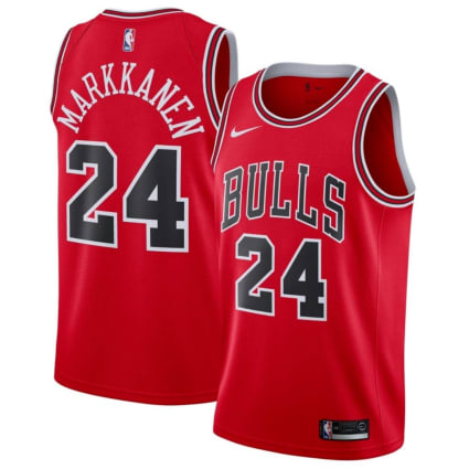
6: cHICAGO bULLS
Name one thing you would change about this jersey, because I certainly can’t. It’s a perfect jersey and will always be a primary uniform for the Chicago Bulls.
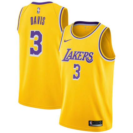
5: la laKERS
There really isn’t much to say about this one. The Lakers yellow kit belongs in a museum based on its history, but it still stands the test of time on looks alone.
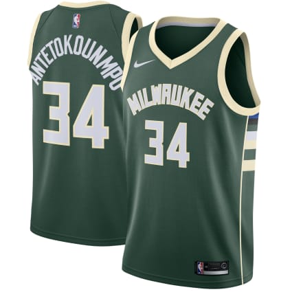
4: mILWAUKEE bUCKS
Not enough sports teams utilize cream in their color scheme. The Milwaukee Bucks have created a brand image that is so unique and original that they deserve an award.
3: pORTLAND tRAILBLAZERS
Everything about this jersey works so well, from the iconic stripes across the stomach to the distinct Portland font. I couldn’t think of a single thing that would need to be changed. Every element of this jersey is perfect as is – just look at it.

2: aTLANTA hAWKS
I am really hoping the NBA continues this trend of giving teams new updated jerseys while also paying homage to the past. The new Atlanta Hawks jerseys do exactly that by feeling very new and modern but still very much inspired by the past. This jersey will stand the test of time and has already become one of the best in the league.

1: cHARLOTTE hORNETS
After only one season in the league, the new Charlotte Hornets uniforms already feels timeless. The NBA has started to understand what the fans want, and boy did it deliver on this one.


